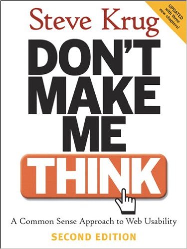
Don’t Make Me Think

As someone who gets engaged by clients to help them work through their problems, you wouldn’t expect I’d like a book titled Don’t Make Me Think, but it’s perhaps the most accessible book on web usability that I’ve run into. In fact, I’d recommend it to anyone who has to build web sites. Why? Well, it’s short. It’s practical.
The basic premise is that when we look at something small thought bubbles form over our head and they often end in question marks “What?” “How is this supposed to work?” “Can I click this?” … Good web usability has FEWER of those question mark filled thought bubbles popping over folks heads. Obvious right, or is it?
How do we get there? Well, we’ve got to let go of some of our misbeliefs like…
- We read web pages. No we don’t. We scan, skim, and flit. We’re trying to extract information off the page as soon as possible. We don’t have time to read. OK, sure the occasional article that’s particularly interesting or necessary but by and large we skim.
- We make optimal choices. Seriously, who has the time for optimal choices? Sources of Power talked about how when pressed for time we don’t evaluate every possibility. The Paradox of Choice talked about the negative effects of maximizing (optimizing decisions).
- We figure stuff out. Really? How much is there about your smart phone that you don’t know? If you’ve got an iPhone tap the user’s name in messages to scroll to the top. How about something simpler, explain how mobile phones switch from tower-to-tower (when they don’t drop the call)
The book includes some marvelously simple questions for determining how many question marks might appear over folks heads.
I’d recommend that everyone on a project to rebuild an intranet read the book – because it’s accessible to everyone. Maybe there’s something to this idea… Don’t Make Me Think.
